Branding & web design for a collaborative project
A multidisciplinary collaboration focused on designing a user-centered product from concept to prototype, uniting research, strategy, and visual design. Lantern was developed as a software concept for a mock company, created to compete with other teams.
As part of the graphic design team, I contributed to the visual identity of Lantern, shaping its logo, typography, and color palette.
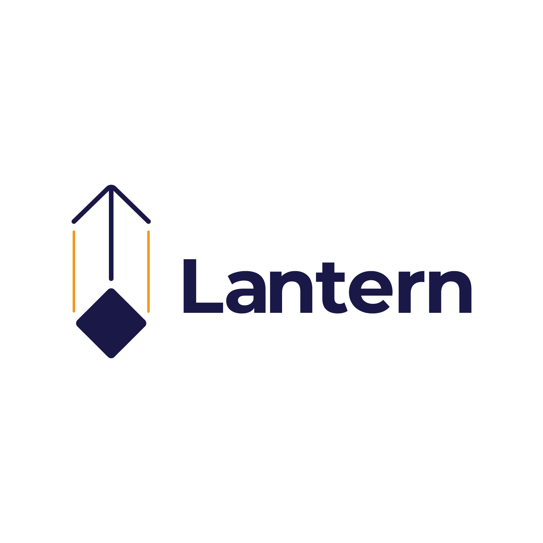
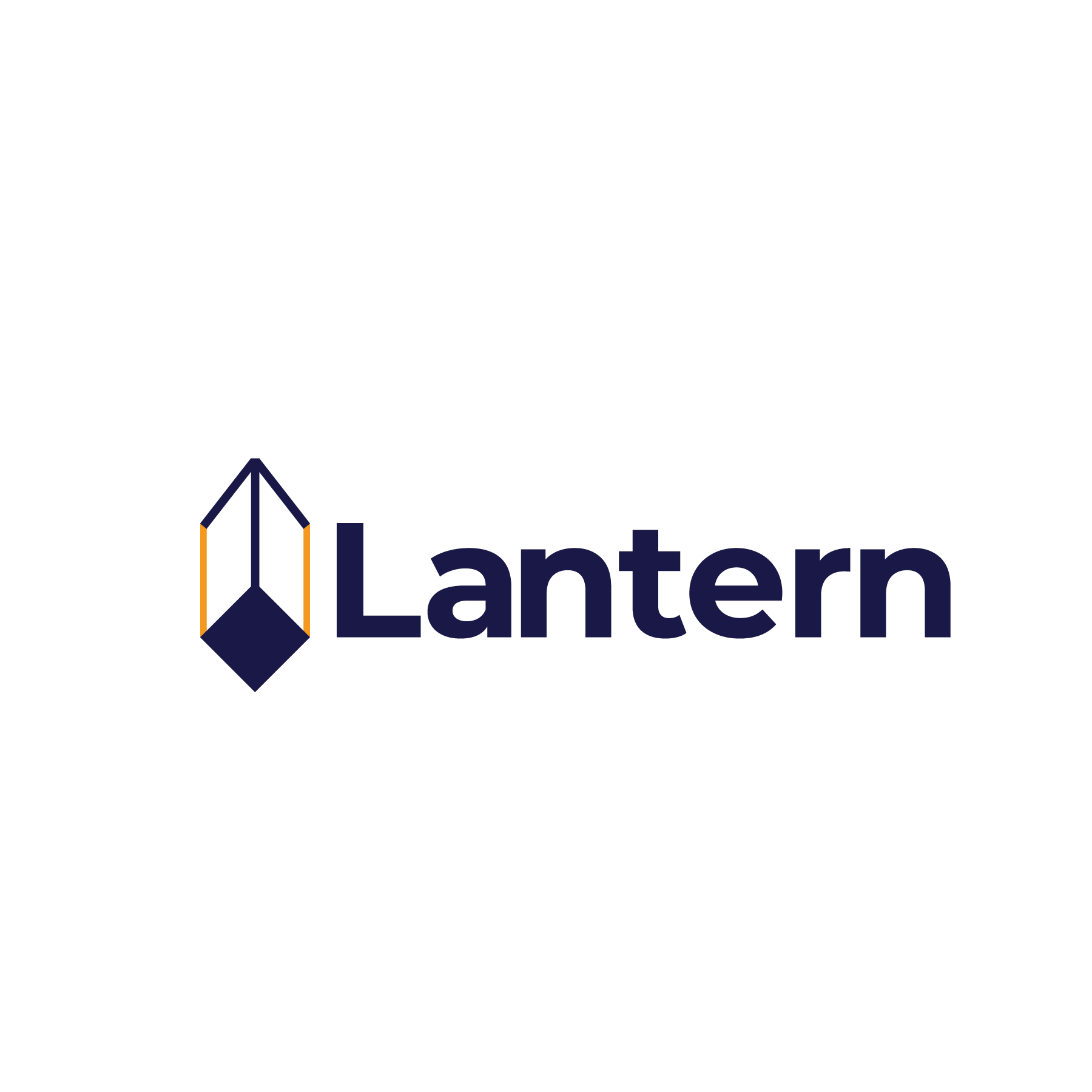
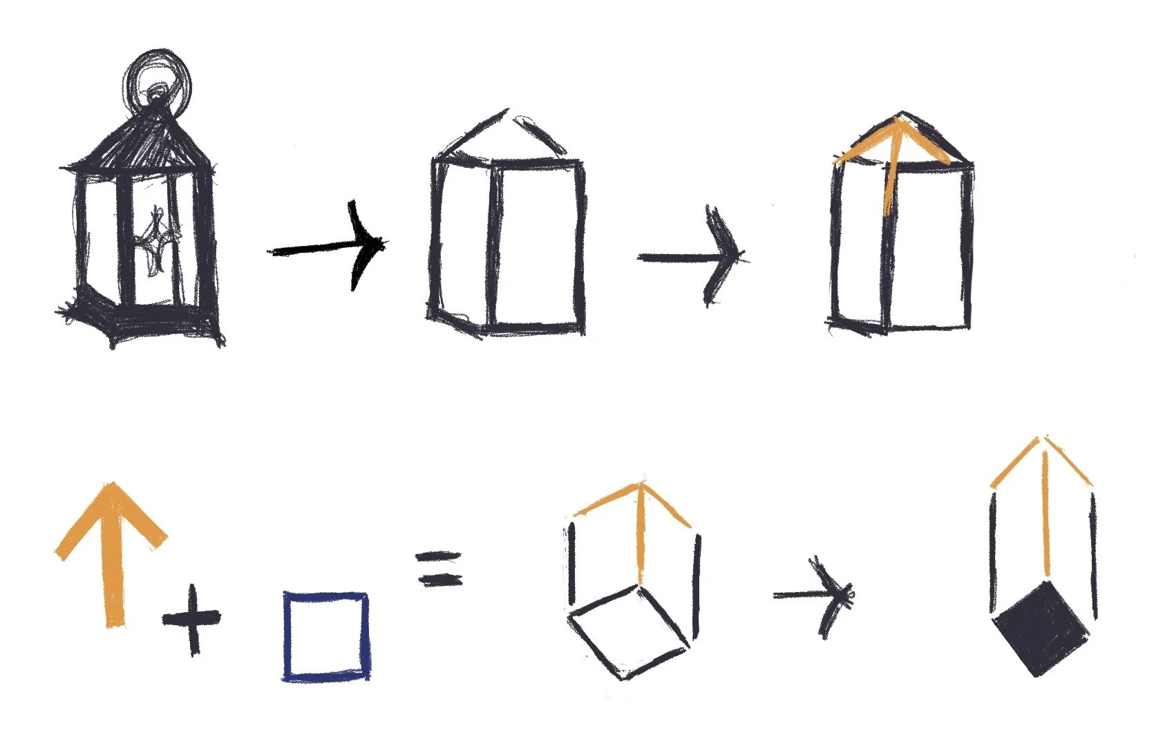
The Lantern mark, developed from my concept for the mark, is a geometric, three-dimensional form that combines a suspended lantern with an upward arrow. Its structure suggests light, direction, and forward movement, reflecting the idea of clarity and progression within a student’s career path.
THE LOGO
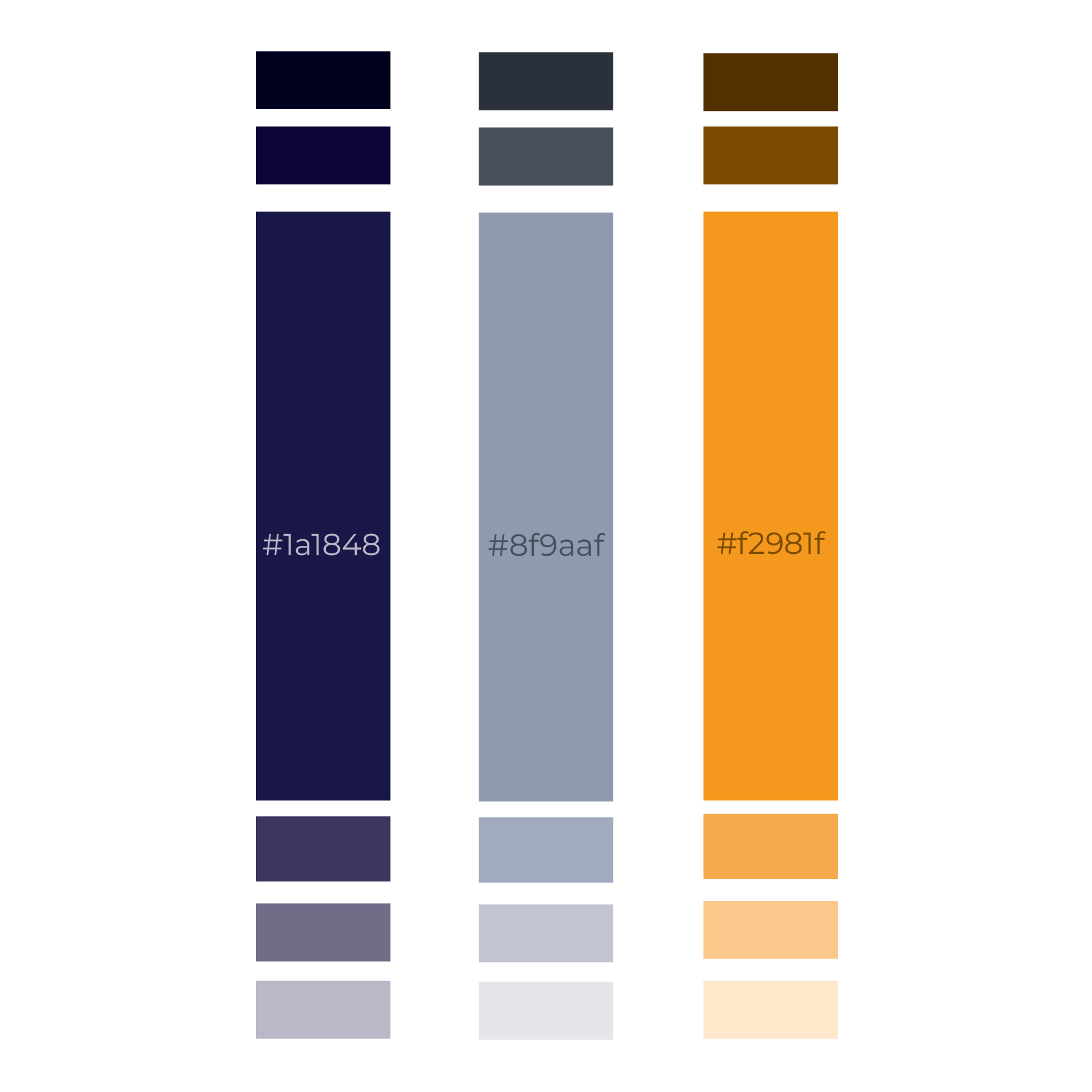
THE COLORS
The palette combines deep navy for stability, vibrant orange for energy and clarity, and neutral gray for balance. Together, they create a grounded yet dynamic identity that supports clear, user-focused communication.
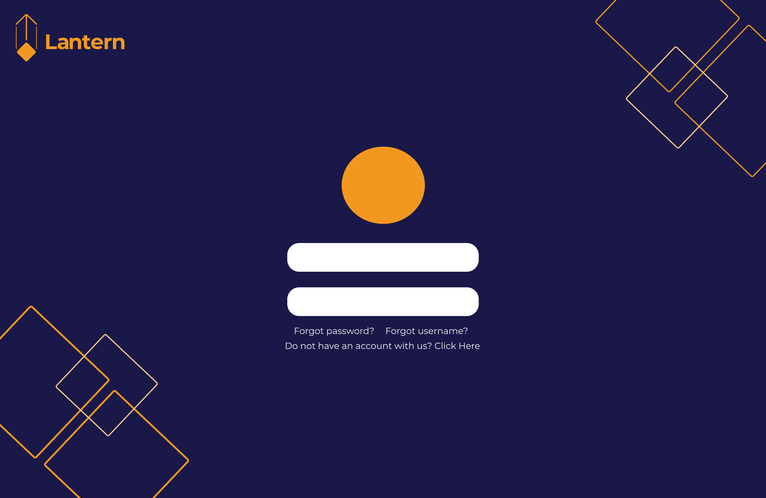
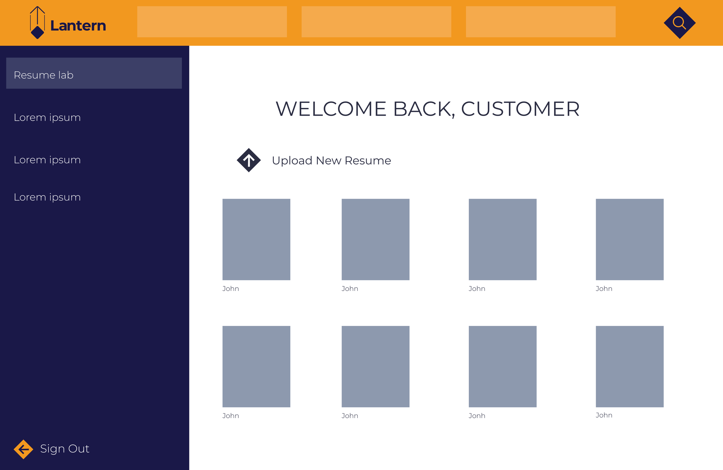
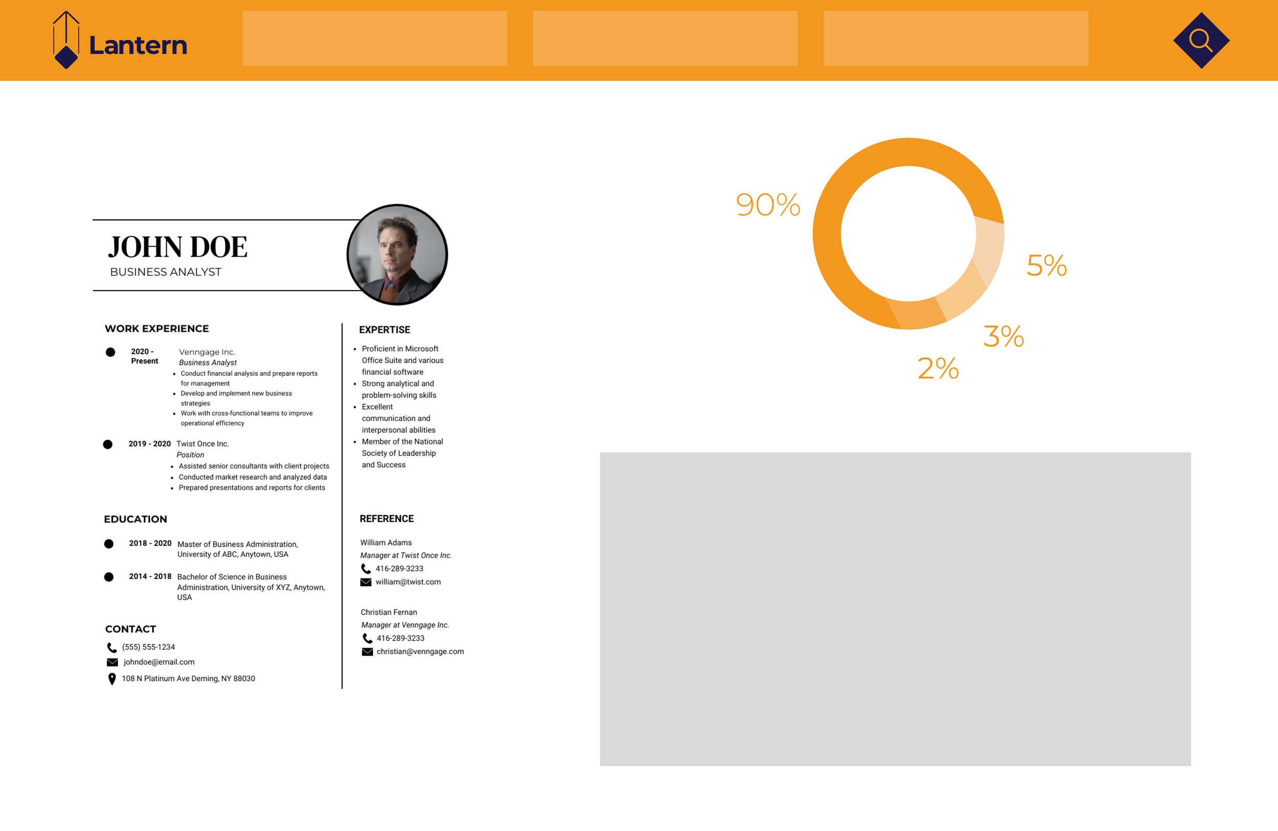
THE WEBSITE
Lantern is a resume analysis platform built for university career development centers. It delivers clear, structured feedback in seconds, highlighting strengths and areas for improvement. The tool supports both students and advisors by bringing consistency and clarity to the resume review process.

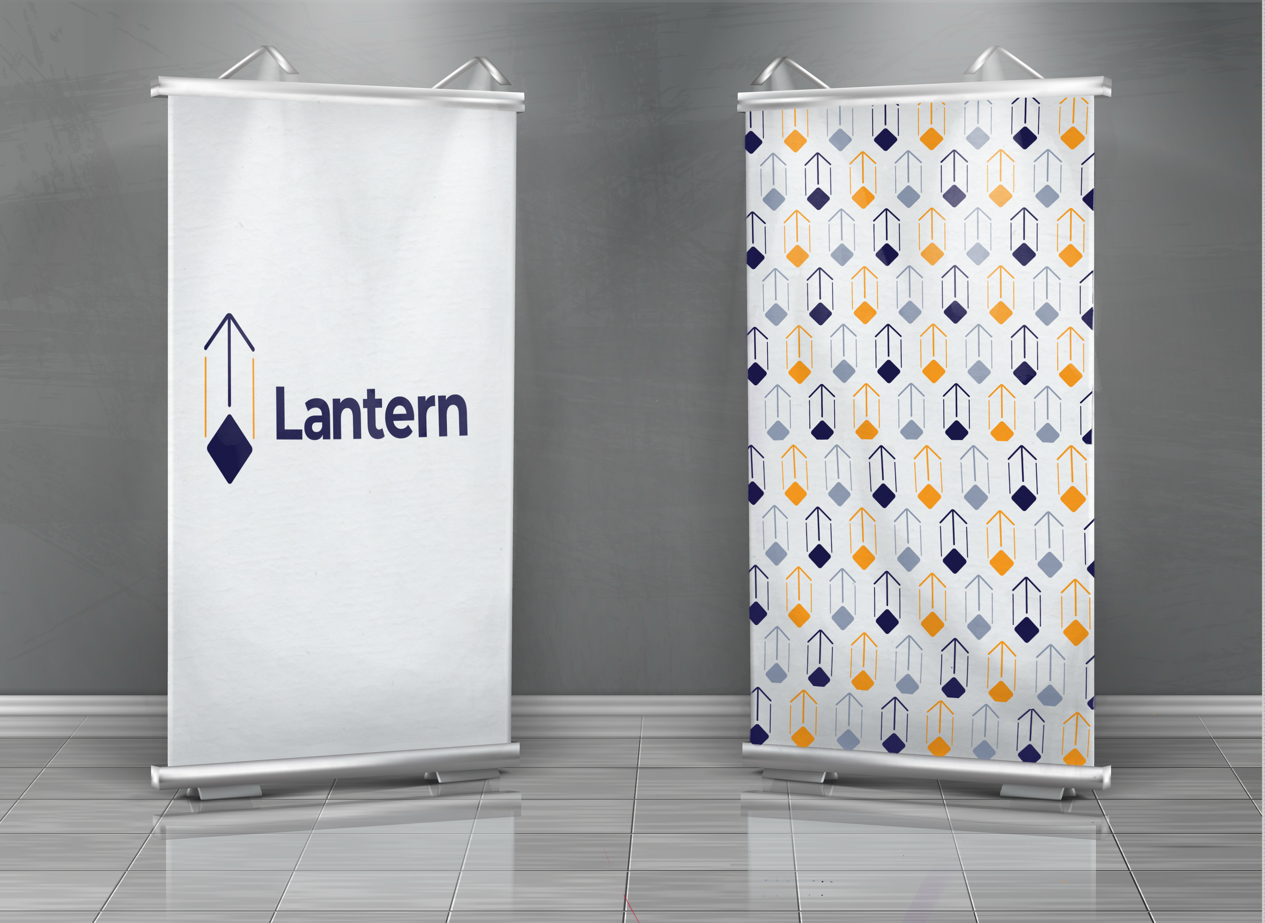
THE PROMO
The Lantern brand was applied across campus materials aimed at students seeking clear guidance on their professional growth. I designed mockups for posters, signage, and digital platforms, keeping both students and advisors in mind to ensure clarity, consistency, and approachability.