Rebranding concept for YWAM Thanet. A proposal shaped by faith, purpose, and place.
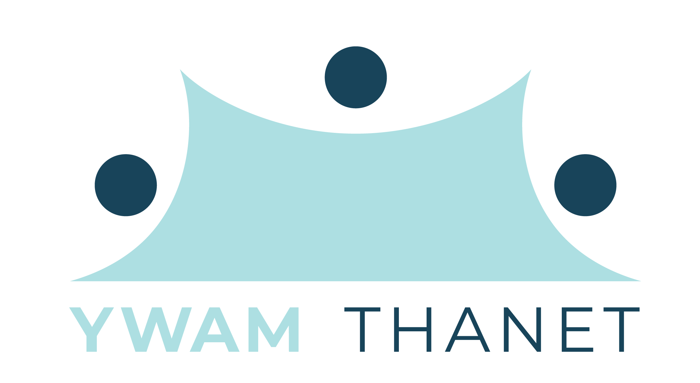
The Logo
This logo brings together a halved starfish for renewal, a sunrise to anchor it in Thanet’s coastal identity, and three cities linked by three figures representing community. Each element works in balance to express growth, place, and the people who carry the mission forward.
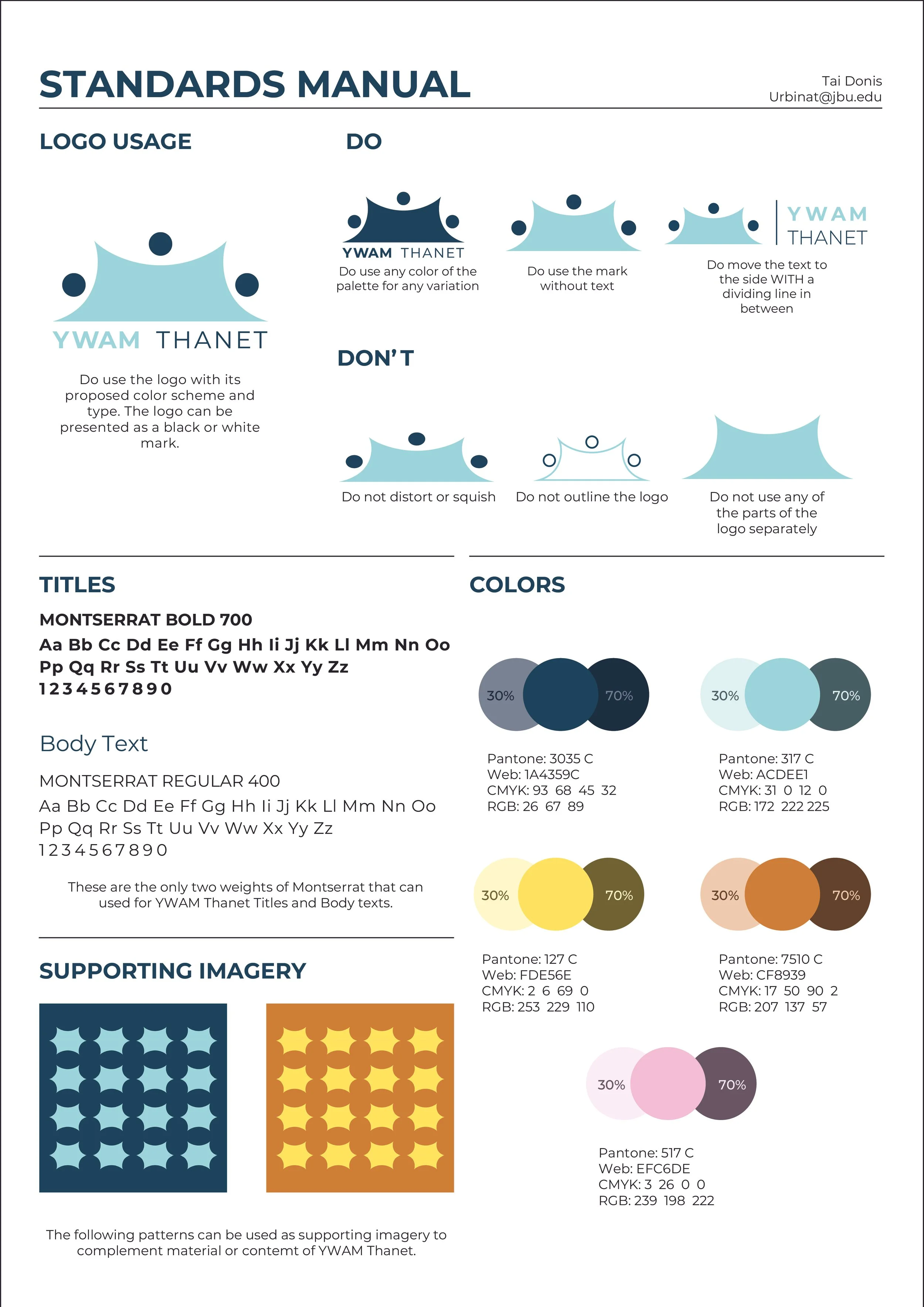
The Colors
The primary palette centers on two complementary blues that bring stability and harmony to the brand. A bright yellow adds energy and warmth, creating a dynamic contrast. Supporting tones balance the palette by softening compositions or introducing gentle warmth where needed.

The Rules
A concise guide that protects the brand’s clarity and form. It defines how the logo, colors, and type work together, ensuring every application feels intentional, consistent, and true to the identity.
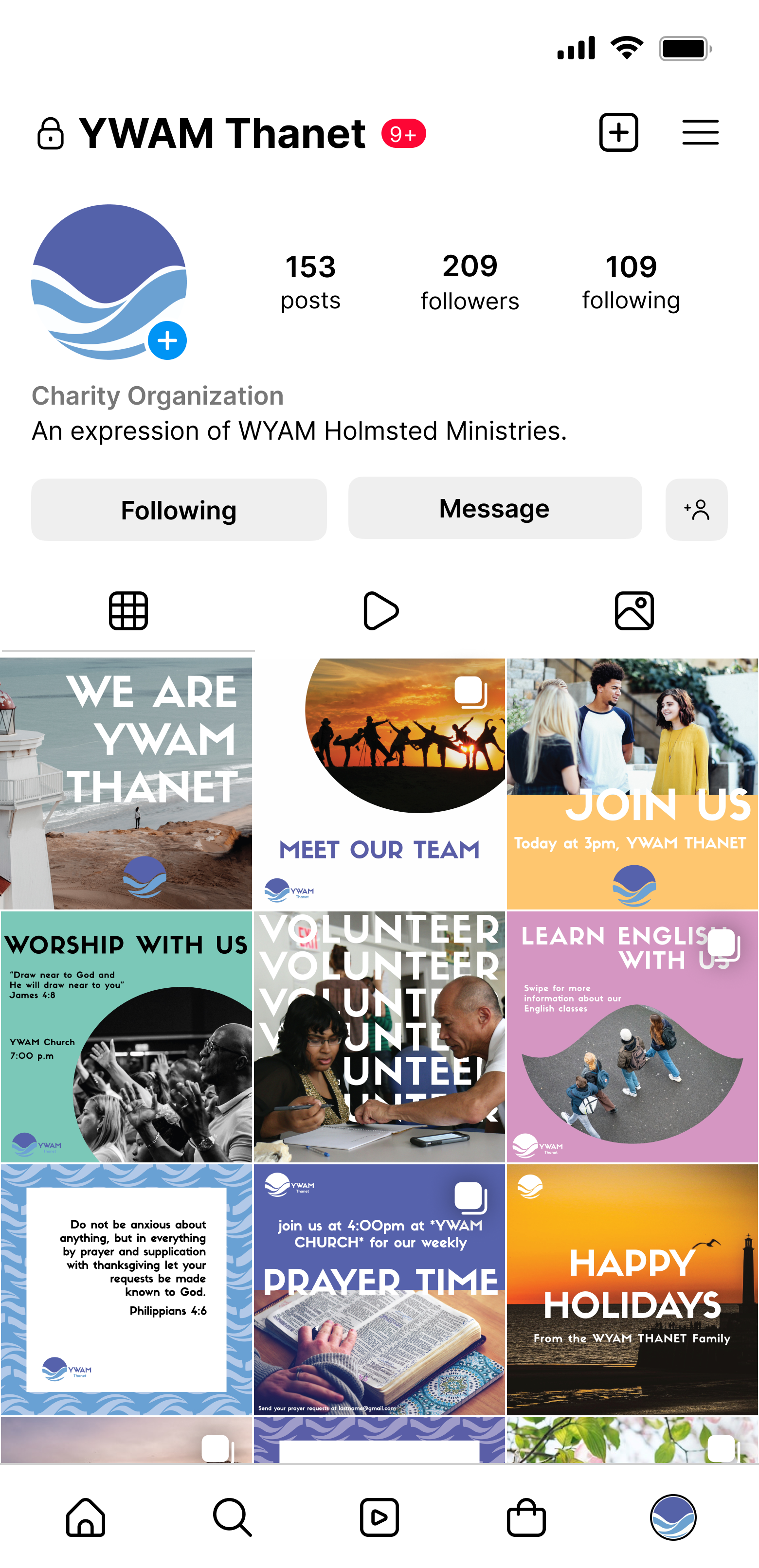
The Promo
The project unfolded in two phases: we began by presenting several logo concepts, and the client selected a design from another team member. That chosen mark became the foundation for a cohesive set of Instagram visuals, translating the brand’s warmth into engaging content for YWAM Thanet.
Stationary
Designed to support clear communication, the stationery package applies the YWAM Thanet brand across business cards, letterheads, and envelopes. The result is a cohesive set that reinforces the organization’s visual presence.